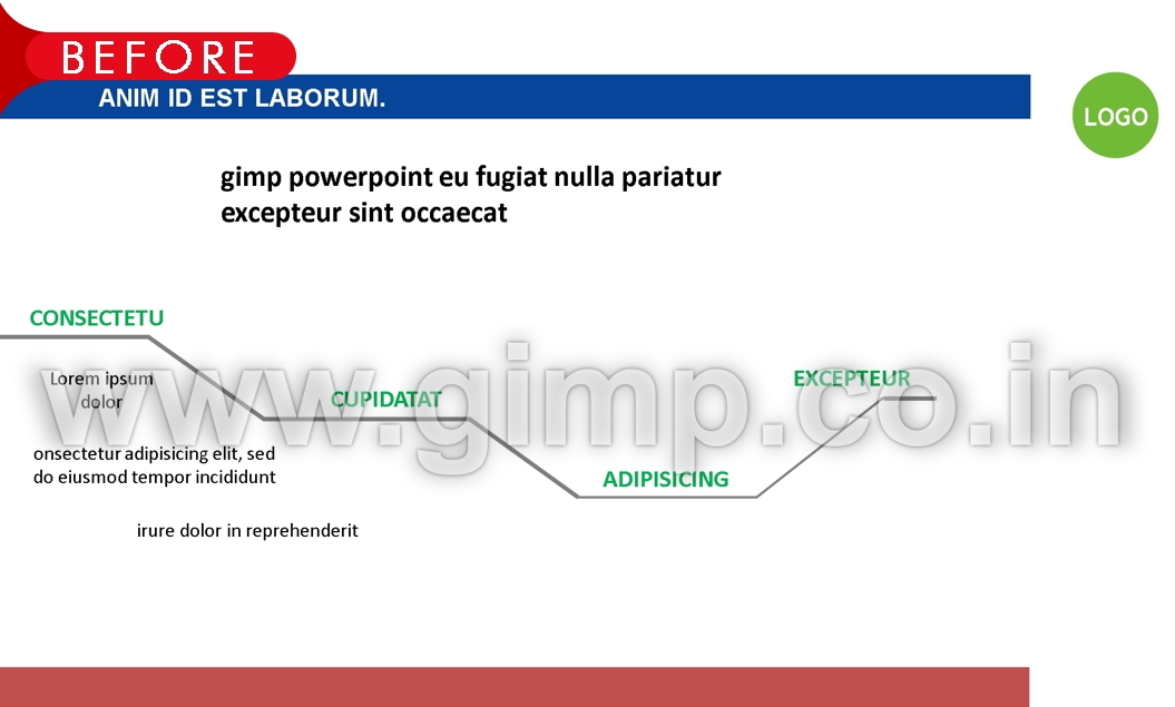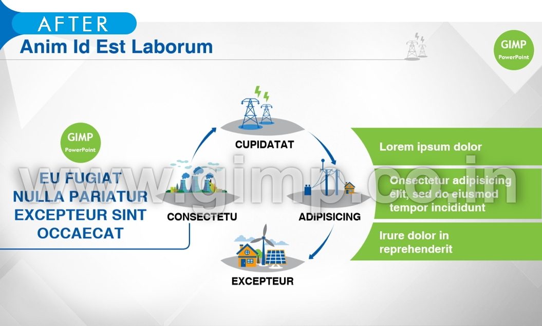
When it comes to the extent of design transformation that is possible in PowerPoint - Sky is the limit! Every potential idea deserves the best possible presentation. However transforming large number of slides can have time and cost implications. To make it easier for our clients we have created 3 different levels of design transformation services, ranging from simplistic standardization to the most intensive and exhaustive transformations which are very creative. The idea is to give our clients a great deal of flexibility to choose the desired level to suit their needs and budgets.
Level 1 – Design Standardization
Sometimes, all you need is a look and feel that is standard, uniform and consistent. A quickly assembled deck of slides, especially involving multiple stakeholders can look un-professional. This level covers basic standardization of your slides so that they look part of same family and speak same visual language.
- The focus is more on adaptation of slides to a template.
- Objects in each slide are either modified or recreated to ensure they follow uniform visual design.
- Typography is adjusted so that text like headings and body text has uniform font, color and size.
- Design elements like tables, charts and info-graphic are tweaked so that they look exactly same across slides.
- Knowing your delivery environment and medium
- Corporate brand guidelines and design rules are followed.
- Exclusion: This level is meant mainly for visual standardization, so creative transformation of visuals in each slide is not covered in the scope.

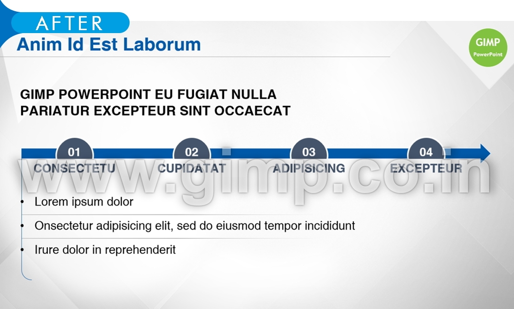
Level 2 - Design Transformation
PowerPoint is a visual medium and sometimes your ideas need to be expressed with flair, energy and style. This level allows you to explore the world of visual possibilities beyond basic standardization. Primarily, the scope covers visual transformation of verbose and plain content into visually appealing presentations.
- The focus is more on visual transformation of slides. This completely alters the view of slides in a very positive manner.
- A professional template and design theme is created first with few sample slides (if template and brand guidelines already exist, we can follow the same).
- A content walkthrough and primary understanding about the core messaging helps us do the transformations that are meaningful and not just cosmetic in nature.
- Judicious use of infographic, iconography, stock imagery and other resources.
- If required content is mutually re-drafted so that it's compact and more optimized for visual delivery.
- Exclusion: This level is meant mainly to move beyond basic standardization and transform the plain content into visual info-graphic. However, this scope does not cover slide-level creative transformations that are more intensive and iterative in nature. E.g. When you get a one-page brochure or a poster designed, you are dealing with just single page of collateral, hence the focus is on creative transformation of almost entire content. Now imagine a deck of 25 slides. A feasible way to transform large number of slides is to spread your efforts across the slides. Therefore, each and every slide of the deck can't be treated as a single collateral. We advise our clients to treat the entire deck as deliverable collateral. However, if you insist on a slide-level iterative designs and creative output for every slide in your deck, we have it covered in Level 3.

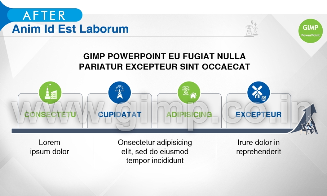
Level 3 - Creative Transformation
Some presentations have a special purpose and they really need to make a huge impact. The stakes are high, the messaging is critical and audience engagement has utmost importance. In creative transformation, each slide of your deck undergoes a rigorous thought process, conceptualization and final visualization. Creativity is at the core of this level.
- Key to achieve this objective is to have a thorough understanding of content and end messaging.
- An inside-out design approach ensures the visual effect is more profound and not just cosmetic in nature.
- The style and theme used in this level is finer and has class - unlike off-the-shelf PPTs.
- We move beyond common ways of representing data and use the approach that's unique and appealing.
- Visuals and stock imagery used is prime
- This level covers initial design-theme iterations on sample slides.
- Each slide of the deck is given maximum focus and treated as an independent visual unit.
- The end result is not just a visually standard and transformed look - but a more prime and finer presentation that encourages audience engagement.
